Plot Types
HouseCurve displays successful measurements using magnitude, phase and group delay plots. Switch between plots by tapping  or
or  or swipe left/right from the edge of the screen.
Magnitude Plot
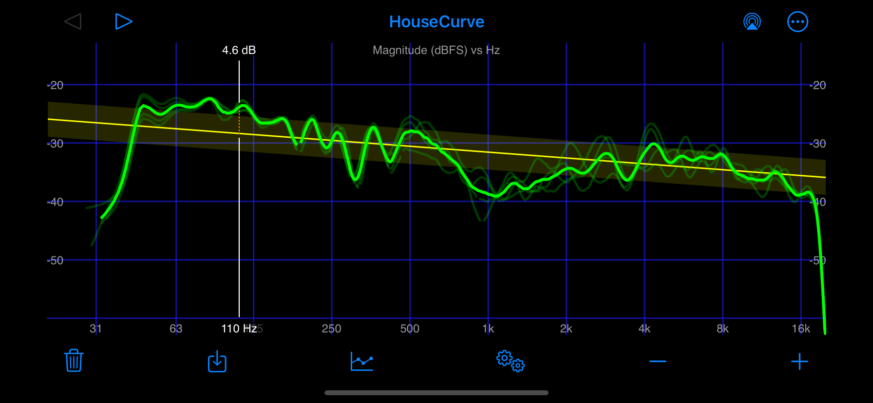
The magnitude plot is the most important plot for tuning. The overall level of the magnitude measurement is the “volume” or output power of the audio system. The level differences between frequencies are what we want to change when applying equalization.

The magnitude plot is commonly referred to as the “frequency response” of the audio system. Since the magnitude plot is displayed in decibels, it is also correct to refer to it as the “power” plot.
Phase plot
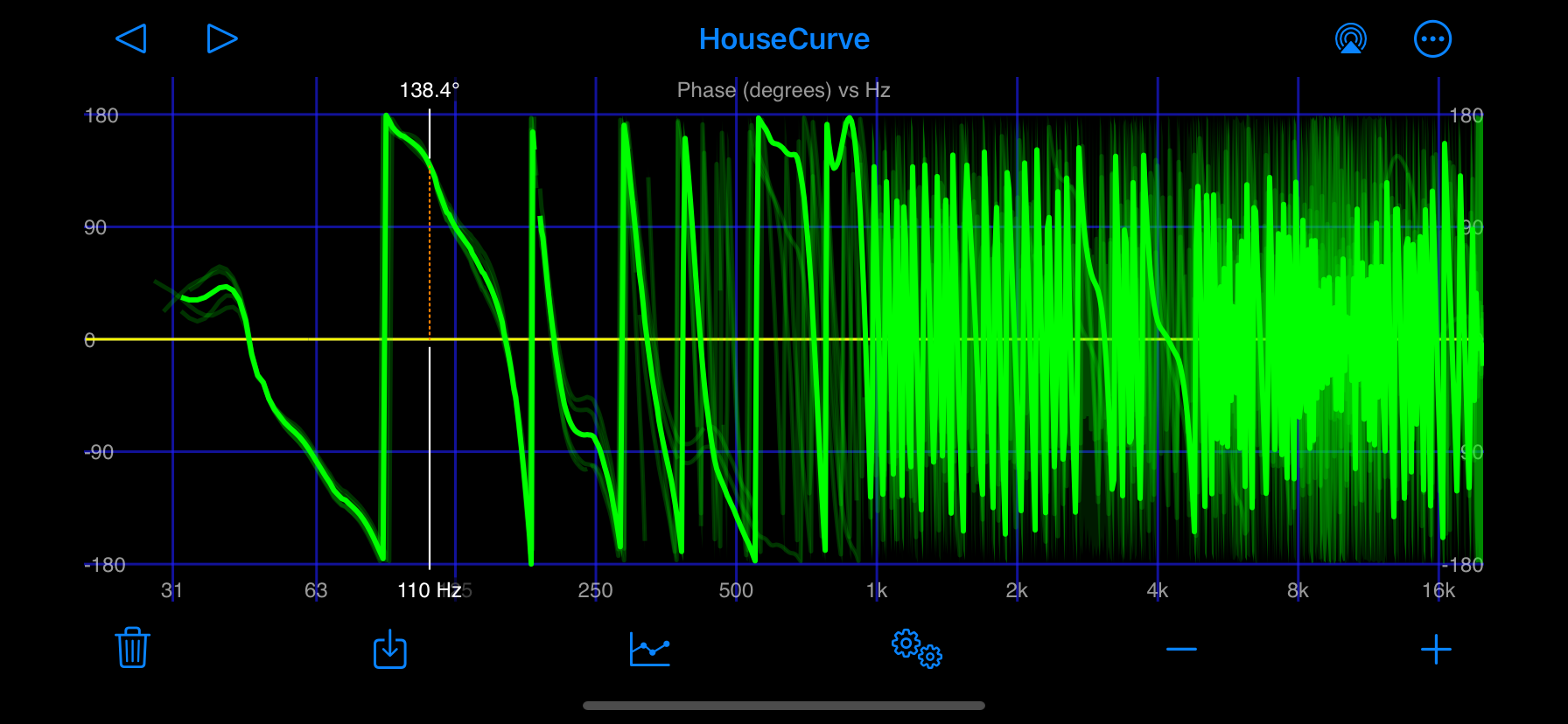
The phase plot shows the phase of the measurement versus frequency. Phase plots can be used for time aligning speakers.

This style of phase plot is traditionally referred to as a “wrapped phase” plot. The vertical green lines on the plot are referred to as “wraps”. A wrap is a frequency where the phase exceeds the range of the plot and “wraps” around to the other vertical extreme of the plot. A wrap is an artifact of the plot and not and indication that the phase is suddenly changing by 360 degrees.
Group Delay Plot
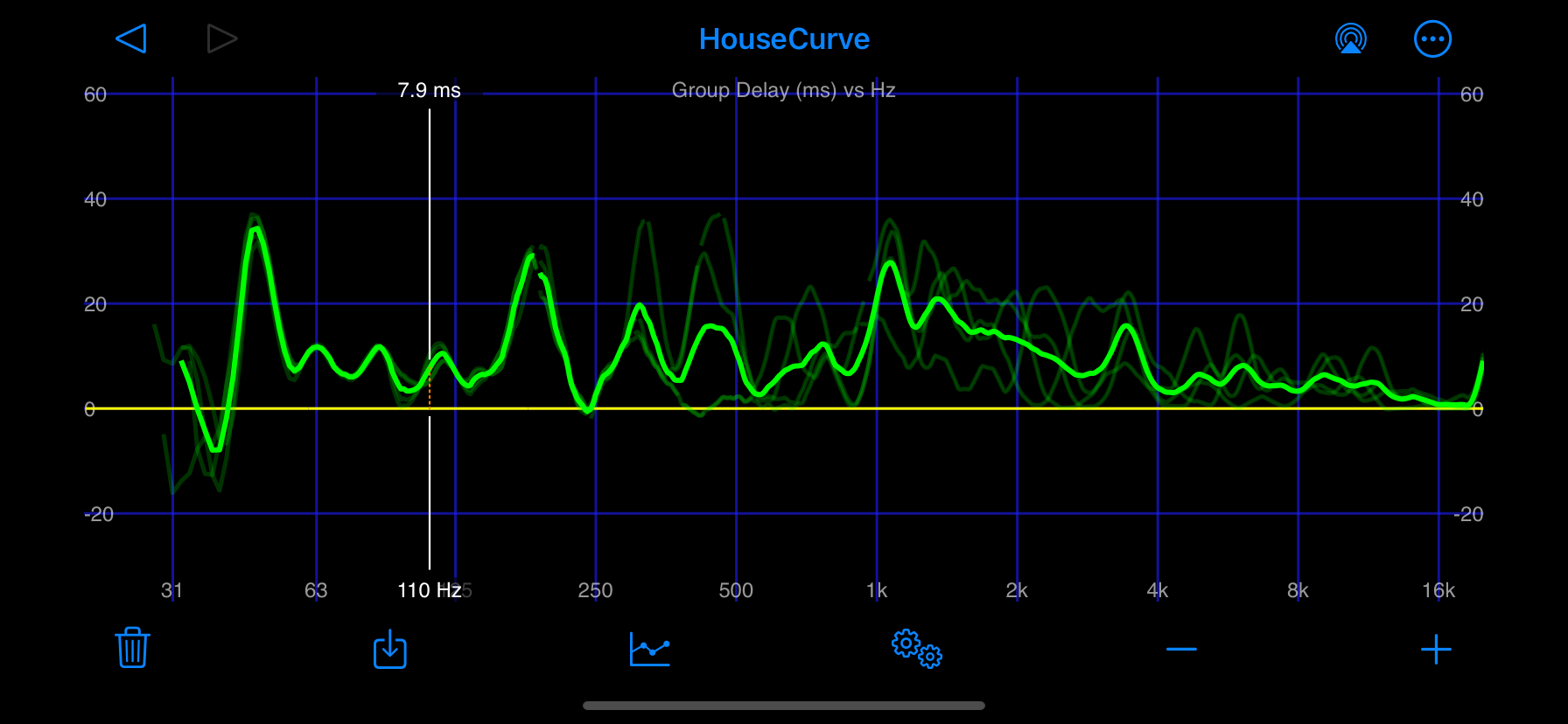
The group delay plot shows “when” the sound at a given frequency arrives at the microphone. The group delay plot can be used to double check speaker time alignment. Extreme peaks in the group delay may indicate regions that can’t be fixed by equalization, such as poor time alignment or problematic room interactions.
